Wednesday 28 March 2012

Rendering practice and Photoshop tutorials

As mentioned in my last post I wanted to explore how I would render the trees in my plan.  I tried several different medias including water colours, marker pens, coloured pencils, chalks, oil pastels and more. I then scanned these into my laptop and placed them into photoshop where I experimented with filters, the rubber tool and opacity levels.


This tree has been made by using water colours, then adding a filter. The lighter areas of the tree have been made by turning the opacity of the rubber (not the layer) to around 12% and slowly clicking the areas I wanted lighter as by using a lower opacity it allowed me to build up the lightness I wanted.


I applied this same technique for the second set of trees but instead of using water colours I used coloured pencils, although I think I may have to a add a bit more tone to these.


After this I wanted to explore different ways I could show more texture in my plan and found a really good website that gives tutorials on how to add texture in Photoshop. The first tutorial was about creating a concrete like texture which I was thinking about using for the paths in my design and the second taught me how to make stone textures, I thought this may come in useful as my design includes stone and rocks however I don’t know how I can use this yet but still interesting to learn.


Sunday 25 March 2012

1:200 crit

Just a quick recap on how my 1:200 crit went.  I think the crit went quite well overall with a lot of good feedback.  

Plan

We were asked to bring in both are 1:500 and 1:200 plans, mainly to see how our plans and ideas for the site have changed. The main change I have made to my site is the change in level for the cycle path as originally in the 1:500 I had it at the same level but I felt that the cycle path should be kept separate so that cyclist have a certain area and won’t interfere with other users.  To reinforce it being separate from the main pedestrian part of the promenade I decided to change the level of it, as a result this led to steps being added and along with that planted steps. Other changes were including rock boulders for seating to provide an informal area that could also be climbed, which would appeal to my chosen concept of playful. I also decided to have some of the mounds completely planted to add further interest and colour from the planting.

Feed Back

The main focus on the feedback

·         Rendering needed to be slightly lighter

·         Needs to include section lines and direction of view

·         Annotation

·         Shadows on mounds to show there three dimensional aspect and also to keep them from fading into the back ground

·         Include trees and the shadows


On this plan I have looked at shadows on the mounds and it really does make the mounds stand out and show there three dimensional aspect. Currently on this plan the trees are missing as im still working on the best way for me to render them but I’ll post the new plan when I have chosen how I want to render them along with the trials.
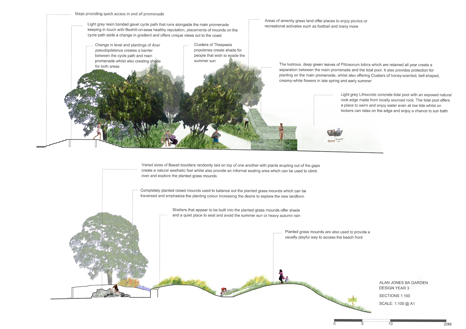

Sections

The four sections I drew for this crit were two at 1:100 both going from the road to the beach front as showing context is really important in all aspects of our drawings. The other two were at 1:50 and showed areas that showed more design detail. For the sections I wanted to try section elevations i think they work well and served as a good first attempt.

Feed Back

The main focus on the feedback

·         Needs a heavier ground line

·         Annotation too heavy

·         Add the level information

·         Condense length of labels

·         Make backgrounds lighter

·         Add more people
·         Smaller scale bar


Sequential Sketches
For the sequential sketches I wanted to use a mix of hand rendering and computer rending using Photoshop.  I wanted my sketches to be colourful and fun and to show a lot of people using the site and the different ways the site can be enjoyed so that the playful concept is reinforced throughout.

Feed Back
The main focus on the feedback
·   Sketches show lots of character but need to be spatially descriptive
·         Too big need to be smaller so all eight fit on a page
·         Possibly look at lightening the sky
·         Keep the edges crisp
·         Visuals work if reduced but the text is all over the place
·         Use the opacity tool more
·         Show the sequence of the sketches on the a plan


Overall I think this particular crit has been one of the most important for me as I feel that I have now developed a style that I like, however it still needs to be refined.

Tuesday 29 November 2011

Sketch Ideas for Knole

The aim for this task was to look at the walled garden at Knole and its historical layers. Then I had to produce several sketch designs which would show what layers I would keep and also show how I would add a modern layer.

Wednesday 2 November 2011

Catch up part 4 – Composition

After experimenting with my chosen model in Photoshop I then had to select four images and make a composition for them. Upon reflection I feel this is another area that I need to work on (yay).


Catch up part 3 – More Photoshop

For this task I had to take a photo of my chosen model and print off the photo. Then trace the outline and scan it saving it as a JPEG so that I could bring it into Photoshop and from Swatches I’d made earlier bucket fill my image.
Here some of my experiments.


Catch up part 2 – Photoshop

When all the models had been made, I then needed to pick my favourite one and take a photo of it so I could use it in Photoshop. Once in Photoshop I had to manipulate its size and scale, include people and place them to a landscape.


Catch up Part 1 – Model making
As it has been a while since my last post here is everything I have been up to
For this exercise I was given a set of words which I had to base my models on. The rules of this exercise were:
·         Dived an A1 sheet of cartridge paper into 4 A3 pieces
·         Use all of the paper to create your master piece
·         Use only a meter of tape (if you run out - tough)
·         Tear, rip, puncture etc to get the concept across

And here are the end results in all their glory


Number 1


    Sadly number 2 didn’t make it L
   
    Number 3

    
    Number 4